Anti-Deskilling – Improved Electronic kit

January 29th, 2013 by Phillipe

Google, Wikipedia, Instructables… We tend to use our computer as a magic oracle that knows everything. By doing so, we may tend to give
it too much trust, while loosing a part of our critical thinking, and passively accetping its all mighty knowledge.

I propose to redesign a random electronic kit, but pretty badly prepared : no instruction, missing resistors or too many of them. To
counterbalance these complications, I suggest a radical approach : to empower even more the computer. It knows the instructions to build
the kit, but you need to convince it you’re worthy enough to get the next instruction by showing your technical skills, their improvement
and by building your intuitive understanding of the materials you are using.

Various levels of complexity / difficulty / degree of interaction can be used depending on the user, its level, etc.

Set content

– A good part of the componenets required for the kit
– “Useless” extra components
– Prebuild arduino board for measuring resitance/capacitance/inductance
– Software

Technical implementation / Interaction description

The prebuild arduino board should be used as a cheap multimeter that can be interfaced with the custom software.
The custom software will first prompt the user with some clear instructions on how to start soldering the kit.

Quickly, the user will reach a point where a component needed is not present as if, or even worse, the computer wont ask for a precise
component, but instead will only give hints of what is needed : a bigger resistance, a smaller inductance … The user will have then to
“build” the component himself by assembling parts from the “useless” extra components, and use the arduino board to ask the computer if
he’s getting closer of what’s needed.

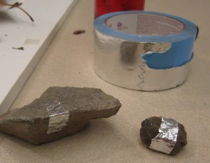
The user is free to use part from outside the kit to achieve the goal. He might try with everyday life objects : piece of copper,
graphite, conductive ink, aluminum.


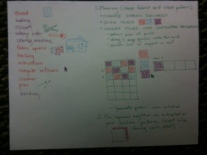
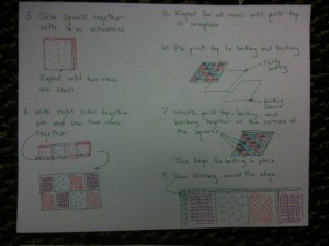
Lovely drawing...

Anti-Deskilling - Sketch

Discussion

I can see a couple of interesting reasons of building the kit this way. First, the user will gain an intuitive and informal knowledge of
the material he can use. Not only he can assmemble new pieces in a creative way, but there is also a new learning curve, for using various
parts (electronic, or not) in an unconventional manner. This idea is closer to the intimate knowledge of the material used by the craftman
versus a cold and mathematical count of colorful stripes on a resistor.
There are other learning paths for the user who doesn’t want to follow blindly the all-mighty computer : you can either improve your
knowledge of the inner working of the kit you’re building, so that you break free from the instructions all-together, or on the opposite
side of the spectrum, improve your knowledge of the inner working of the arduino/softaware tool we propose, and defeat it by building a new
tool that would go through all the expected values and therefore to unlock all the instructions.

In any case, the user must be more creative than if he were following a classical instruction manual, and learn from this experience,
which was the intended goal of the kit.

Inspiration and possible examples
Interactivus Botanicus

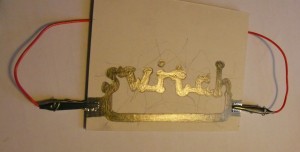
http://blog.ocad.ca/wordpress/digf6b02-fw2011-01/2011/10/assignment-5-a-switch-made-out-of-pencil-and-paper/

Switch - Anne Stevens

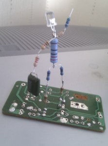
Resistor Man - fleck_bucket


Sand Tones online as Instructable

January 28th, 2013 by Michael Nitsche

Here is the Instructable for last term’s Sand Tones project – now aptly titled Craft Cymatics.

Anti-Deskilling Quilting

January 28th, 2013 by The Artist Formerly Known as Kate

The purpose of this kit is to allow for maximum creative control, while using the affordances of computer software to aid in the design process. Making the top of a patchwork quilt with squares of fabric requires little sewing skill. Essentially, the quiltmaker simply sews a series of straight line to join each square in a row, and then join the rows together. For that reason, I have not made alterations to the actual construction process.

The real craft of making a patchwork quilt is the design process: selecting fabrics and creating a pattern (simple or complex) to complement the color and print. The pattern making process includes determining the sequence, size and shape of the fabric squares. For this reason, this kit would include more fabric squares (in a wide variety of colors and prints) than necessary. Since the creation of the pattern is what I consider to be the critical skill in quilting, it would not be provided to the user. Simple directions would be provided to explain the construction process, but not a specific sequence of squares.

The digital component in this kit is provided by a software program that assists the user in the creation and alteration of the pattern. The analog design method would be to use graph paper and colored pencils. It’s a fine method, but difficult to make changes, experiment, and get a good sense of the finished product with simple markings. With the computer, the quilter could scan or photograph fabric swatches, creating digital fabric squares that are true to life. The program could use algorithms to generate symmetrical designs based on several rows designed by the user. With a few simple clicks, multiple squares can be swapped and changed, making the design process much faster.


Antideskilling:3D Wooden Puzzle Craft Kit

January 28th, 2013 by Chunhui

3D Wooden Puzzle Craft Kit

Kit components (what we get from store):
wooden pieces, sand paper, instruction, glue

Procedure:
1. take wooden pieces out
2. make the wooden pieces smooth with sand paper
3. follow the instruction to assemble the pieces
4. fix it with glue

3D Wooden Puzzle Craft Kit Redesign

Kit components:
unfinished wooden pieces, sand paper, instruction, glue

And new components
saw, sanding sealer (a lacquer or other coating formulated to give better filling than the topcoat products), digital paint gun, paint (colors), rubbing compound, swirl mark remover, polishing compound

Wooden Piece

Rubbing Compound and Polishing Compound

Digital Paint Gun

Digital Paint Gun

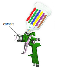
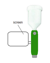
Digital paint gun can do color mixing and teach people how to paint on wood. The gun contains a couple of different paint colors inside and it will mix them to give the color that people want. The proportion of the colors will be shown on the screen of the gun so people learn how to match such color. As people painting, the camera on the gun will monitor their work and give people suggestion if some paint problem is detected. Mixed reality technology will be used here to point the problem spot to people so they can get it in an easy way.

Redesigned Procedure:
1. cut the wooden pieces with saw
2. make the wood pieces smooth with sand paper
3. make the wood pieces smoother with sanding sealer
4. paint with digital paint gun and let the color settle down
5. put rubbing compound and swirl mark remover
6. use polishing compound
7. follow the instruction to assemble the pieces
8. fix it with glue

Anti-deskill:
By playing with new craft kit, people learn the basic procedures and skills to make wooden craft.

Sketches from Keller and Keller

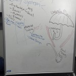
January 24th, 2013 by Michael Nitsche

Below our scribbles from the Keller and Keller text – to guide your practice analysis for next week:

Second challenge

January 23rd, 2013 by Michael Nitsche

Based on our breakdown of the Keller & Keller text.

Find one practice you feel comfortable with and analyze it using Keller&Keller. What are the actions? What is the actions’ “emergent quality” that evolves from the activity system you are looking at? What knowledge is applied and altered in the process? At what stage is an “umbrella plan” defined? On what grounds is that plan made? What are the ingredients of that plan?

I would suggest to use the outline and key words we discussed in class to guide your analysis. This is meant to let us develop the method which we will apply to our analysis of an existing craft practice in the foreseeable future. So if you find a problem in the Keller & Keller approach and can provide an improvement – by all means.

Antideskilling: A whittler’s touchstone

January 23rd, 2013 by some bears

Makers have more opportunities than ever before to put together almost anything they can dream of from a kit of parts. They assemble these pre-fabricated parts and components from directions, and ultimately have a working product. But is it a craft?

This project works in the tradition of such kits, providing directions and parts for the maker to assemble. The goal is to whittle an egg from a piece of wood. Wiring electrical components creates the feedback mechanism that steers whittlers toward an outcome. But unlike kits ordered from Sparkfun, Maker:Shed and other DIY supply shops, assembling the electrical components does not itself constitute a finished product.The maker must exercise patience and manual skill manipulating wooden materials with a knife.

The hope here is that digital components mentor amateur crafters toward a tacit understanding of the raw materials they manipulate with tools. Whittling is a simple handicraft amenable to this sort of digital intervention. Newcomers to whittling usually undertake this simple project first: fashion an egg from a block of wood. The task reveals the responsiveness of wood to the force of a knife. The wood grain, the choice between a push or a pull stroke, and the wood’s hardness all have to be negotiated in this beginner’s project. The use of specialized tools is a contentious point among whittlers. Purists consider a sharp pocket knife the only suitable option since anything specialized reconstitute the practice as carving. They also reject the use of stainless steel knives, since they cannot be suitably sharpened.

Whittling is undertaken by individuals slowly passing time. As such it resists ever being subsumed by mechanization since this would remove whittling’s essential context. Master whittlers who find faces in fallen branches will never be “workers” in Rissati’s sense, since the spontaneous discovery of form with natural materials is never “simply labor produced by the non-creative hand.” Craftsmanship “depends on the judgement, dexterity and care which the maker exercises as he works.” This kit helps the amateur acquire a sensitivity to the relationship between material, tool and form, so that better judgement, dexterity and care can be applied to more ambitious projects in the future.

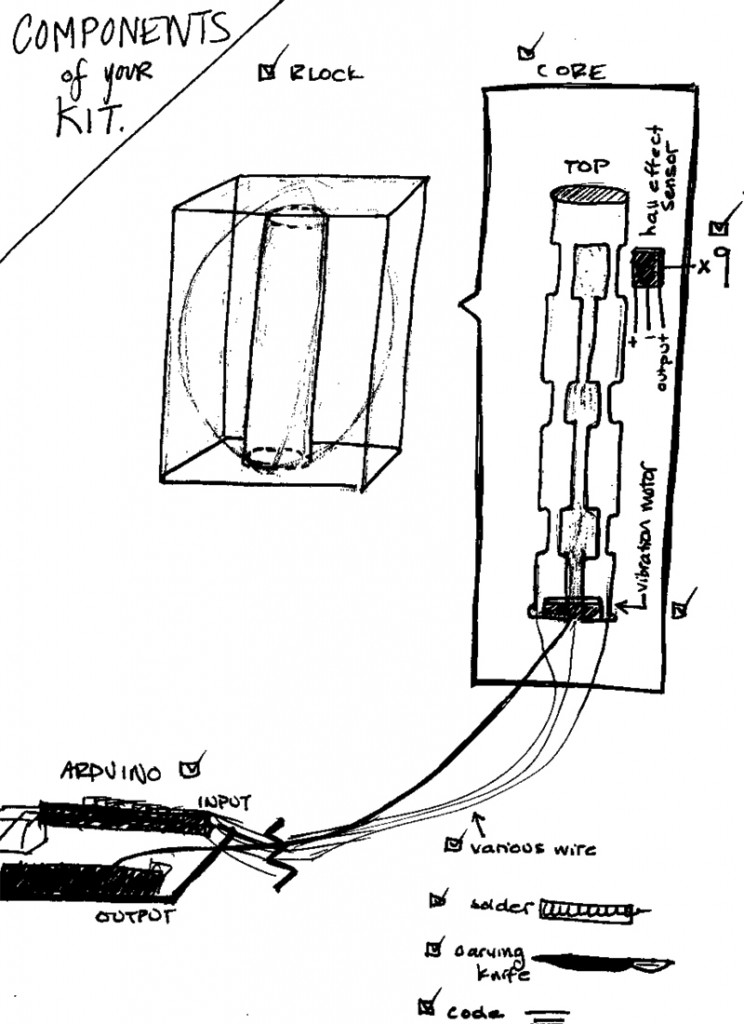
The Kit:


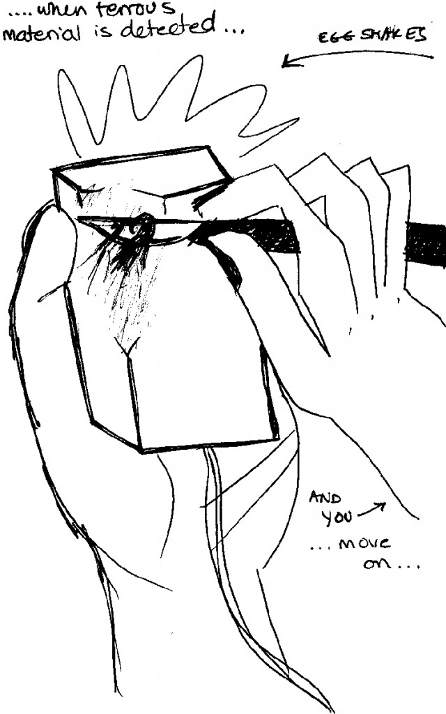
A block of balsa wood has a hollow core. Into this core we’ll insert a dowel with 3 notches on three facets, for a total of 9 notches. Into these notches, the maker will affix small and inexpensive hall effect sensors. These sensors act as proximity sensors for ferrous materials. When the steel (an iron alloy) knife comes within a calibrated distance to the sensor from outside the wood, the sensor will trigger a small vibration actuator that shakes the egg. This tells the whittler that the cut in this particular area is deep enough, and that it is time to move on to another area to shape the egg. Once the egg has been fashioned on all sides, the core can be removed. The end product contains no electronic parts. The wiring acts as tutor, and provides feedback to guide the amateur’s exploration.

First 2013 challenge: Anti-deskilling

January 16th, 2013 by Michael Nitsche

Design challenge: This assignment builds on a combination of Dormer, Risatti, and McCullough. McCullough particularly calls for a “defense of skill” and Dormer (and others) discuss the difference between assembly and craft in a comparable way. Between following rules, which could be done by a machine, vs creative making, which depends on the personal investment and skill.
Your design challenge is in-between these poles: present a kit of prepared items and simple to follow rules toward a specific object, but (re)design this kit in such a way that one specific skill is not replaced by the materials and manuals at hand. Include a digital component in that kit.

Squishy Recognition for Performance and Sensing

October 17th, 2012 by NOTAndrew Quitmeyer

The Project that I would like to pitch for our midterm builds off my previous design challenge for the Sean Curran Dance Company. I want to suggest explorations of the Disney Research Touche system for applications beyond HCI gesture-detection. I wish to examine this technology in areas of human and animal performance and in conjunction with feedback systems from other technologies like computer vision or actuation. The proposal consists of three parts:

  • Building our own Touche system with Arduinos
  • Testing Touche directly with alternative applications
  • Experimenting with Touche feedback systems
The core activity of the class will be using the system to experiment and conduct many small performances.

Build a system

First we would build a couple of systems with the instructable about the Touche system: http://www.instructables.com/id/Singing-plant-Make-your-plant-sing-with-Arduino-/

Then we would thrash the system to determine its responsiveness, robustness, and noisyness. We would probably reimplment a lot of their gestural examples to see how it actually functions minus all the hype.

Alternate Applications

Once we have a better, tacit understand of how the device can work, we can try experimenting! Here are some suggestions I have thought of.

Feedback

It will be interesting to incorporate feedback into the system. This can be done directly, as with the proposed puppetry idea where actuators would manipulate a plant to make the Touche sensor recognize a particular gesture. It can also be indirectly, where a performative system (like a human or animal) recieves the feedback from the sensor (like in sonification) and the system alters itself accordingly.


Two interesting technologies to tie in would be, actuation and computer vision. The CV and Touche system could readily augment each other since they collect complementary data.

Constellation

October 11th, 2012 by some bears

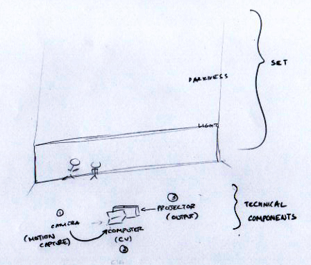
This performance explores the interplay of weight and lightness to reimagine the construction of heavenly bodies as products of collaborative movement on earth. As dancers perform a set piece involving their interactions with each other on stage, a digital intervention captures traces of their position and saves them above the stage as astral objects with subtle movements of their own.

Stars are composed of the same material components as our bodies: carbon, oxygen, and metallic elements. The idea that mysterious elements of outer space arise from dancers’ movement on earth is something the audience can ponder while watching the performance unfold.

Modern dance embraces a dancer’s contact with the floor, liberated from ballet’s formal restrictions of ascension into space. Thus, contact with the earth that generates ascending digital forms is made more salient through a juxtaposition of process and product.

Technical Implementation
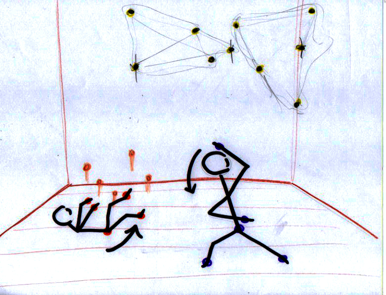
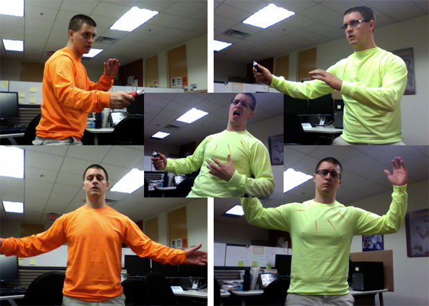
Dancers are outfitted in form-fitting costumes featuring spots of color at five different points on their body: on the feet/ankles, hands and pelvis. Each dancer sports a different color.
Using computer vision, a camera tracks the movement of these color groups as dancers move through space. When the dancer makes a swift upward movement, the acceleration of these points will cross a computational threshold and trigger the generation of digital forms: A projection mapped to the stage appears to throw these five points into the sky from these points on the dancer’s body.

This action generates a digital form with physical properties, allows it to move gently about the space as if it were a constellation in the night sky. Existing constellations can fade as new ones are generated from movements below.

This framework is extensible. Sound can play when constellations are generated, becoming gradually less intense as they fade. Dancers are able to generate the set for their performance as a result of set movements. Exploiting the inaccuracies of computer vision tracking, the resulting night sky appears different with every performance no matter how consistently the phrases of movement persist.

Joint Relationships

October 10th, 2012 by The Artist Formerly Known as Kate

Inspirations:
On our call, Elizabeth Giron emphasized the importance of problem solving in the choreography process.  She referred to it as a “verbal problem turned into a movement problem.”
Two components of “Force of Circumstance” inspired this proposal:

  • making movement accumulate (as Elizabeth demonstrated with her S phrase).
    • The accumulation aspect reminded me of a looper, a device usually used for music and sound design. Loopers have been adapted to video for use in dance performances (Movement Looper at MIT or Dance Loops at Utah Valley University)
  • spatial counterpoint
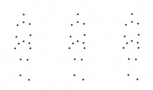
    • Sean Curran’s emphasis on clean lines, body shape and linearity  reminded me of an animation made for Issey Miyake’s APOC collection in 2007 (http://www.youtube.com/watch?v=x4_mK9CebB4). The animation is a loop of 3D tracking data from a walking model.  Her joints are represented by white dots on a black background, with lines occasionally joining the dots in a variety of patterns, some resembling shapes of the body and Issey’s clothing, some more abstract.

This digital intervention would combine looping with minimalist skeleton tracking.

Setup:
Kinect and Laptop with skeleton tracking application that can map at least 13 points/joints
Projector
Wireless device (worn by dancer to start and stop recording a loop)

Process:
The dancers’ movements are tracked with dots, using the tracking application:

The dancers can start and stop recording a loop with a wireless device. Using the laptop, lines can be drawn, connecting dots within one dancers “skeleton,” or the lines can connect the same joint on multiple dancers.


Since Sean is “a hawk for detail” and gives much consideration to line and shape, I wanted to give him and his dancers a platform to highlight his choreography. By turning the dancers’ bodies in points and lines that can be reshaped and manipulated, the technology provides thousands of relationships between parts of one body and parts of many bodies. It’s a new kind of exploration of body shape and movement.

Full Stage Multiplayer Theremin

October 10th, 2012 by FL-11630

1. Set up Processing application that maps sound pitch, volume, pan, and timing to motion detection (video camera delta will work for this).

2. Point the camera at the performance.

3. Start the Processing application.

4. Offer the resulting real-time audio as a new way to experience the show’s fast and slow bursts, follow shifts of energy locations on-stage, and types of movements by dancers.

Iteration would be required to achieve the types of tones and timings desired by the team. The present pre-alpha version of the software is for demonstration purposes only, and at this time mostly reflects that tone, pitch, and amplitude can be made a function of total motion detected (frame differences) within different areas of the camera.

Experimentation with how to “play” any given motion-to-audio mapping could promote different types of exploratory movements. In addition to providing an optional audio dimension to the movements, conceivably with enough improvement this design could provide a way for visitors with severe vision disabilities to enjoy the pacing and stage action of the performance – roughly similar in principle to the aquarium research across the hall from DWIG.

Guide: Text Page

Guide: Images Page

Minimally-invasive Semantic Registration for Dance

October 9th, 2012 by NOTAndrew Quitmeyer

For my design concerning our visit with the Sean Curran Dance Company, I propose a simple system for identifying and responding to the individual poses of the dancers. As described by Elizabeth Giron, their company focuses on experimental grammars of movement but within a highly formalistic setting. There is minimal stage design or additional props, and the focus always seems to be on the synthesis of the music and the ritualized actions of the participants. I sought to design a system for recognizing full body gestures without interfering with the dancers’ movements.

Computer Vision

The first concept to spring to mind, was to use a computer vision system. In a highly controlled environment, like the standard sized theater on which they typically perform,  several different types of computer vision systems could be calibrated to perform quite well. A generic 2D system could segment the background and foreground, and try to infer dance poses based upon matching the profiles of the dancers to pre-determined models. This could function in a somewhat responsive way, but the granularity of its detections would be poor. More sophisticated setups could synthesize the input from multiple camera arrays to capture 3 dimensional data, but this also significantly increases the cost of the setup, the complexity of the processing, and its sensitivity to the original calibration. Cheap devices like the kinect could be used, which also help automate the process of skeleton finding and pose estimation for humans. The sensing range of the kinect, however is quite limited, and it is also designed to estimate poses for only 1-2 humans at a time. In all the mentioned computer vision concepts, you also run into lots of problems when one dancer occludes the other from the camera’s visual range, or when they intertwine or connect bodies. Moving props will also interfere with the vision. Another problem with the computer vision approach is  scalability. Most systems that work with 1-2 people well, (like the kinect) will not transfer this ability to larger crowds. If the spatial dimensions of the performance area change, this will also result in a needed recalibration, or recoding of the processing.


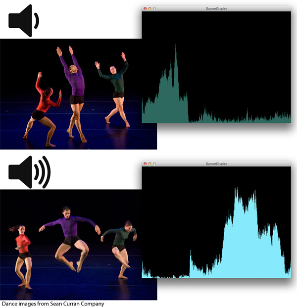
<p>Capturing Dance - Exploring movement with computer vision<br></br></p>
from “Capturing Dance – Exploring movement with computer vision”

Haptic Gestural Recognition

We could also outfit our dancers in specially designed clothing, which detected the kinestetic movements of the wearers. Many ideas, like power-glove style concepts, have been implemented in the past. This method ties the performative device to the user’s particular outfit however, and thus is poorly scalable, and requires re-implementation for different clothing. Also the coverage of the sensors determines the effectiveness of the device. Thus you have a trade-off between expense, sensor density, full body coverage, and freedom of movement and dress.

Swept Frequency Capacitance

Disney Research recently released an impressive demo describing a relatively new method for identifying poses. Whereas most systems (like the computer vision) always first attempt to track the position individual segments of a target object (like a body, or hand), and use this tracking data to determine the current pose, Disney’s new Touché system determines gestures and poses without regard to spatial positioning. Instead they send an array of small currents through the human body at several different frequencies. The different frequencies penetrate the body in different ways when the body is in different poses. Thus you can build a profile for each individual pose, and when this specific profile is reached you know that the body is assuming this particular pose. The best part about this product is that the only interface between the human and the machine are two simple electrodes taped to parts of his or her body. The small microprocessor needs to be carried with the performer, but its apportage is not fixed to a specific spot on the body. The data can also be sent wirelessly from this device to the master computer.

Sato, M., Poupyrev, I., & Harrison, C. (n.d.). Touché : Enhancing Touch Interaction on Humans , Screens , Liquids , and Everyday Objects, (c).


The main problem with this approach was that due to its novelty, few people knew how to implment such a device. Luckily, a clever hacker posted a series of instructables illustrating how to enact the Touche system with an arduino and a few additional components! http://www.instructables.com/id/Touche-for-Arduino-Advanced-touch-sensing/

Thus I propose that we build some wireless, Touche systems of our own, connect them to dancers and begin to play. Interesting points to consider will be:

  • For full body gesture detection, where are the optimal locations for attaching the electrodes? Wrist and opposing ankle?
  • How sensitive is the device to these gestures, what kind of fine granulatiry of pose and movement can be achieved?
  • What intelligent, expressive ways can we attach the two other elements featured in the dance, light and sound, to this device?
  • What happens when two performers contact each other? Presumably this would scramble the gesture recognition, but could also lead to quite interesting results.
————————————

Also as a bonus, this final application in the video is where you can see a glimpse into the sad, overworked lives of the creators (embedded video below queued up to the correct time):

DM Carnival

October 9th, 2012 by Adam

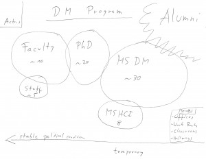
The ecosystem I am studing is the DM Program at Georgia Tech.

The system is characterized by asymetry in terms of interest between different types of actors. The following proposels are performative interventions that aim to amplify communication between the actor types and to provide a better work together atmosphere:


1. DM Message Cleaner

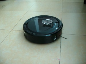
A modified Intelligent Robot Cleaning device is not only constantly cleaning offices, classrooms and the hallways in the DM program, but also delivers Messages via a Text-to-speech generator, which Actors of the DM Program uploaded anonymously via a online portal.


2. DM Symposium

The DM Symposium is a collaborative project of everyone in the DM Project. The goal of the project is to develop within a year a transdisciplinary event that utilizes all core strengths of all actors in one big event, that last over 3 days and is open to the public. The overarching theme is the mergence of theory and practice.


3. DM Carnival

The DM Carnival is a yearly event of two weeks where all actors in the DM program which there roles for two weeks. The role selections happens by random, a computer makes the selection. The actors have to run a diary of their experience for the whole two weeks online (video, text, audio, etc.), which makes sure that nothing is going to be edited afterwards.


After the DM Carnival is over the data gets presented on a permanent Installation at the entrance of the 3rd Floor office area to remind everyone about the different perspectives inscribed in the system. The goal of the annual tradition is to provide the actors with a sensibility for their different roles. This is an entirely internal event, which contributes to the inner psychological stability and balance of the system. Additionally the carnival is a wonderful opportunity to do things the way they think they are supposed to be done.


Supermarket Sweep

October 3rd, 2012 by Joseph

The supermarket brings together a vast and different variety of different products and life which is prepared for human consumption in a way which has become a complex system of codes and conventions. These conventions are rarely considered by the consumer unless the delivery method is slightly changed. This is heightened by trying to purchase different products in different countries. For example, in Spain: fruit is weighted and measured by the consumer whom then organises the price tag from a ticket machine. This makes someone from a country where the convention is different to that experience the purchase in a whole new light.

Supermarket Sweep attempts to take the environment of the supermarket and push this concept one step further. Key elements that can be changed are the different products, the staff and the customers themselves. Products can be changed by turning dead produce into live produce: In the eggs section, there will be a thousand live chickens, all running around inside a fridge display cabinet. In the vegetable section the veg will be still subterranean or live on trees, potatoes in the ground and grapes still on the vine. People would have to pick what they want as if they were farming it.

The key environmental components to be explored in this study are the customers and the staff which are substituted by actors, turing the supermarket into both a playground and theatre. Staff declaring undying love for each other on the public address system and asking other customers to find colleges for them to ask them to marry them. Customers having fights, arguments and general drama in the isles. People performing magic tricks in different food sections… like turning the eggs into chickens. Trolly races being declared on the public address that will be coming down certain isles and around certain corners. Juggling acts with tins of food.

Performers will then gather at the exit and hold out contribution boxes and thanking customers for attending the show, all in an attempt to change perception of the environment from that of a supermarket to anything but a supermarket.

Dark Colony

October 3rd, 2012 by NOTAndrew Quitmeyer

For my ecosystem I chose (big suprise) an ant hill. The target I had for my performances was to create interactions that manipulated the creatures’ environment and individual roles on a daily basis. The inspiration was partially from the film “Dark City” where a group of mysterious others experiments on a city of humans by reshaping the lives, memories, and environment while the humans sleep.


http://www.youtube.com/watch?v=QJh359H57UA&feature=player_detailpage#t=2249s

The other half of inspiration came from a part in Niko Tinbergen’s book, “Curious Naturalists,” where he re-arranges the local environment of some insects to deceive their homing capabilities.

Therefore, I wanted human/digital/ and ant interactions which were split between day and night. During the day, at the height of ant-interaction, the digital “other” should primarily observe and sense. Then, when the ants return at night to their colony, the digital and human components re-arrange the outside world based on their earlier observations.


I came up with 3 performance ideas based on this concept.

  • 1) The ants’ trails around the entrance are recorded and tracked during the day. This input generates a new route for the human on her daily commute.
  • 2) The ants’ trails around the entrance are recorded and tracked during the day. The observing/tracking digital device then squirts a viscous liquid which hardens into ant-height cylinders over all the trails. The movements of the ants during the day, are recreated as walls during the night, forcing the ants to constantly re-think new, optimal paths. This could be accomplished with a peristaltic pump:  http://vimeo.com/13532728#at=0
  • 2 alt) Instead of squirting out walls, the ants are surrounded by a mesh of actuated  dowels forming a grid. The dowels raise or lower depending on the day’s interactions. The more movement in an area, the higher the dowel. This also forms the walls mentioned before, but he daily routes do not accumulate.
  • 3) Tiny cheap robots (linked bristlebots with sensors), are scattered around the ants’ nest. They record proximity in 3 directions. High proximity is mapped semantically to high levels of ant-interaction. At night, bots with low interaction, re-arrange themselves, while high-ones freeze.


For do-ability reasons in a short time-scale, I decided to elaborate on the 3rd option.


The Robot City

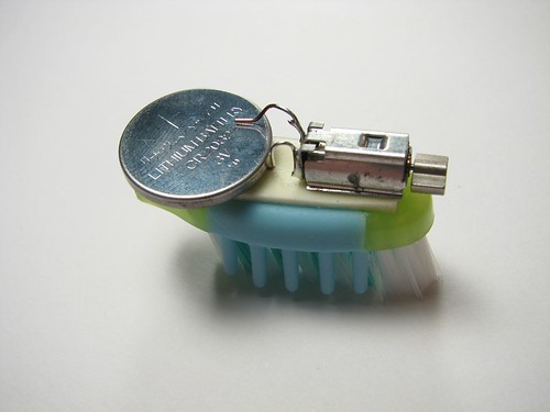
Our robot obstacles are based off the cheaply locomotable “bristle bots”

A power source is connected to a vibrating motor (a motor with an offset weight), and motion goes into the phalanges triggering movement. Here are the additions to create interactive, shifting buildings for the ants in the project. Three bristlebots will be tied together for semi-directable motion. Each bristlebot will be connected to a cheap proximity sensor. The bristlebot’s amount of movement will be regulated by the amount of interactions it receives during the day through close-proximity to ants. Areas of high-interaction will move less, than those of low interaction. This will result in dramatic interruptions to whatever the ant’s optimized routes for the previous day were.  The bots will be housed in small building facades to reinforce the “shifting city” concept to outside human observers.

Alternate

The bots could be optionally made by attaching the vibrator to a pinecone or other natural element in the ants’ world.


Library Interventions

October 3rd, 2012 by FL-11630

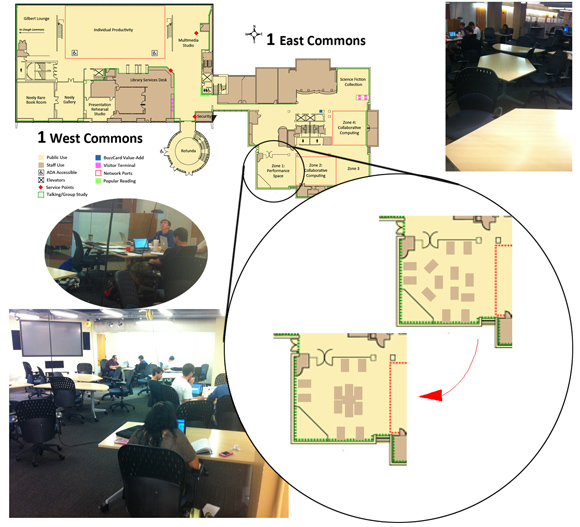
Ecological System: Georgia Tech Library, “performance zone” (tables on the first floor near where there used to be a coffeeshop, across the glass)

Actors/Entities:
• Students that have lots of work to do (majority here are male, average age ~21)
• Laptops, turned on, most presumably with internet connection
• Security camera pointed at the big screen+speakers presentation system

Nonentities:
• 13 tables
• Outlets all along the wall
• Outlets hanging from the ceiling in 4 places
• About 3 dozen chairs
• Vending machine drinks, snacks
• Pens, pencils, paper
• Presentation screen with large screen and speakers
• 5 overhead hanging speakers

Notable Conditions:
• Consistently chilly air
• Consistently bright fluorescent tube lighting
• A looming sense of focus and/or despair

Performance Interventions:
1. The aim of this intervention is to affect relations between entities, by getting strangers to sit at the same table. A simple Arduino device is attached to the underside of the centermost table, with switches wired to the edges where nearby tables can be pulled to hold the switches in. When any switches depress, a signal notifies the performer to return to this area and return the tables to formation.

2. The aim of this intervention is to confirm that the ecological system’s strength in asserting its identity as an entity having its own PRA. The performer’s task in this case is to see whether he or she will be rejected by the space, rather than accepted by the people in it. This is done by doing something that the people would not object to, if it were not being done in this ecological system. The performer brings a laptop with an obviously 2-player game, classic Street Fighter 2, plus 2 USB gamepads. Volume turned off (blaring audio annoyance would be too obviously a violation), the performer plays the game in single player, until A New Challenger Approaches. They play a round or a few, but when that person leaves to work, the person continues playing, with controller 2 laying out again as bait. If/when someone asks the performer to leave, the space has asserted its identity as separate from that of its individual entities.

3. The aim of this intervention is to extend the ecological system by scattering its entities into alternative contexts. As set up, the performer creates a php file that will recommend another specific study location on campus, selected at random, and direct the student to go study there. Ideally, some navigation information or map should be provided as well. Below that should be links to these articles from LifeHacker and Lawyerist, which both suggest that changing study/work location yields improved results. A QR code directing to this URL can then be printed and taped to the corner of each table in the room. If people get curious to check the QR Code, they may be persuaded to try studying at one of the other recommended locations. The performers role in this case is to hang out working at the table, periodically taking pictures of the QR code then leaving for a bit, later returning and repeating, to entice people to try it. If this proves effective, it may help those students discover a new favorite study location to alternate, and it also makes this otherwise popular section less crowded, creating a partial vacuum which may inspire more students to wander over and try it (first studying there, then being coaxed into trying some other location as well).

Guide: Text Page

Guide: Images Page

The Otamatone Oracle

September 24th, 2012 by Adam

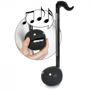
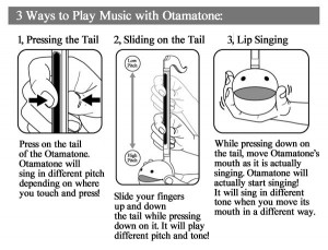
The Otamatone is a device art object by the Japanese artist Mazwa Denki. It is a musical-note shaped singing toy which requires two hands to be played: one hand controls the pitch by sliding one finger up and down the stem, the other holds and squeezes the head.

The design of this device art object is already making a statement for the connection between musical expressivity and the communication features inscribed in it. The Otamatone Oracle is celebrating and consequently extending this idea, by offering a translation of the predictions made using this device.

The interactor is asked to express his current feelings and personality by using this very easy to handle and highly expressive musical device. Since the Otamatone is hacked and hooked up to an Arduino board, the way in which it’s played generates a poem. It becomes a digital oracle between oral and written poetry.

This way the user does not only get a reason to become a musican, but also generates a personal piece of literature, which is in direct relationship with his personality and expressivity. The predictions will be on display together with the recorded music for the time the Otamatone Oracle is in town. And yes it is possible to write books by consulting the Otamatone Oracle.


Examples of poems generated by the Otamatone Oracle:
 

“Oh how I love you squealing

It sounds so utterly appealing

Make I stop before I drop”


“Silence

American

Juice

Migrane

Opera

Vibrato

ducks

sonar

flatline

two”


“Food

Ghost

Lives My socks

Socks

Sucks!

Holy Tomatoes

in grocery town

hippy Flopping Berger

Benz”


“casserole cows are

being strangled

by the ducks that

hide in the trough!

who’s laughting

now? silence”


“problems help

snake charmer

menace

ambulance

neerst monitor”


“O ili

yusuuuu

veally

veally

veally

iiiiiiiiii

v

v

it ate

tate

tate

t tt t

e

e”

New Challenge

September 19th, 2012 by Michael Nitsche

Find an example of a ecological system – what we are preliminarily call a “communal space.” Identify the actors and notable conditions in it. Create some form of visualization of it (to communicate your idea) – then design at least three performative interventions in it that use some form of digital media. Elaborate one of these cases and present that as your case study. Avoid to produce a “flavor of hell” as Laurel calls it.

Deep Breath Music

September 19th, 2012 by The Artist Formerly Known as Kate

A SKILL OR PLAY PROCESS WE ALL SHARE

Breathing is process both automatic and conscious. Though we can hold our breath for a period of time, humans, literally, can’t help but breathe eventually. It’s a basic bodily function and almost completely universal.

Deep breathing from one’s diaphragm is a skill. Yes, you can get better at breathing. Meditation is called a “practice” for a reason. Everyone can participate in this activity because everyone can breathe; however, some might be more skilled deep breathers who are able to manipulate the process of music making.


EXPLOITED IN A WAY THAT THE ACTIVITY BECOMES PRODUCTIVE

In “Deep Breath Music” the user stands in front of clear glass and a theremin-like device with photoresistor (and possibly other sensors), such as a Beep-It. The Beep-It emits a high-pitched tone when the sensor is exposed to bright light. When you block the light by moving your hand in front of the sensor, or tilting the Beep-It away from the light source, the tone gets lower. A button on the side allows you to turn the sound on and off so that you needn’t slide from note to note.

Waving a hand in front of the sensor reminded me of blinking, which, in turn, reminded me of the similarly automatic process of breathing. By breathing onto a pane of glass in front of the Beep-It, the user will create a temporary opacity that will block some of the light from the sensor, lowering the tone.  In theory, the user should be able to create music (of some sort), just by breathing. The system could be enhanced with more sensors, perhaps measuring temperature (warm breath on a cold surface) or humidity or even wind.

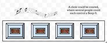
Because the range of tones would be fairly limited, you would need more than one user to create sounds resembling a melody. A hand bell choir would be a good analogy. If each of six or seven user had their own Deep Breath Music setup, with a slightly different light source, they could work together to make music, instead of simple beeping sounds, just by breathing onto panes of glass.

MyTone

September 19th, 2012 by Joseph

MyTone empowers the user to design their phone technology through the creation of unique ringtones for different incoming calls. The idea is for the user to crete their own unique pattern which is adapted to different colours for different callers. This tone can then be associated with its colours when individuals ring the phone owner.

Cue Abstraction, pioneered by Irene Deliège states that we use Gestalt type grouping to identify salient pitch and rhythmic components which stand out in music. Our mind categories these cues and this leads to our perception of how they relate. The given pattern by the user will therefore let then Identify the patterns they create even though the notes being played are fluid.

The colour component allows users to base their perceptions around a more familiar framework. They do not need ton concern themselves with emotional connotation, but simply choose an abstract colour representation of the pitch patterns they like. Although these different pitch patterns follow the same thread of pitch relationships, each colour should have different emotional connotations depending on the tonality of the chords they come from.

Skipping Homes | Throwing Rocks | Bucolic Building

September 19th, 2012 by NOTAndrew Quitmeyer

I propose a relaxing, non-teleological system for throwing rocks and creating unique construction materials. For the human the process will be: first skip/hurl stones into a lake, stop whenever, then finally assemble together the resulting uniquely shaped logs.

Setting: Quiet lake-shore strewn with rocks, pebbles, dirt, sand, leaves and twigs

1) Ubiquitous skill/ play property; Throwing Rocks

Throwing rocks into water, or the slightly more advanced process of skipping stones, is a meditative rewarding process. My design seeks to incorporate the whole of this process with minimal digital intervention. Thus the person will perform all aspects of stone skipping as if the digital device did not exist.

Scan the shore for choice rocks. Dig up rocks with your hands. Weigh, compare, absorb the information of the stone. Fling the rock towards the water. Visually and Aurally connect with your object during its brief, flaming period of life. The feedback from the rock’s performance is incorporated into your body and encourages further throwing in order to validate the newly learned information.

Throwing rocks is enjoyable because it constitutes the the core function of intelligence and learning: continuous analysis of prediction.

 2) Digital Analysis

There will be one, minute change to the typical stone skipping process. Before flinging, the human will attach a thin strip of reflective tape to the rock’s edge. This is the only interfering component of the system. Next to the human, on the shore will be a smart phone whose camera is facing over the water. The camera has a small peice of infrared filter over the lens. An infrared flood lamp sits next to the phone, also directed over the lake. When the rock is thrown, the mirrored strip will beam pulses of information back to the camera lens. The stone’s relative position, velocity and spinning frequency can be determined through non-difficult computer vision methods. The splashes will also probably reflect the infrared radiation in a manner which can help the system collect more information about the flight and its aftermath.

3) Digital Exploitation of Ubiquitous Skill for Production: Strut Casting

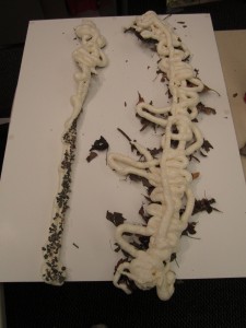
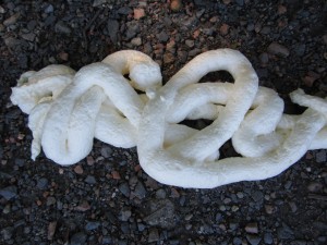
Tethered to the computer vision system is a simple two-axis pivoting head which controls a spray nozzle. The head’s orientation and spray will be controlled by the information collected through the camera. The substance sprayed will be a thin line of a foaming, bonding agent that rigidly hardens within seconds or minute. Ideally this substance would be a biodegradable version of Dow’s “Great Stuff” foaming sealant. The rigid lines would be cast directly onto the surface of the beach forming dirty logs which physically incorporate the environment. Every stone tossed generates a new line. The user can keep throwing logs and the system will keep squirting onto the previous log, making it thicker and thicker. Whenever she wants, she can kick (or dig) the generated strut out of the way.

The exact material for the rigid foaming substrate is not totally fleshed out yet, but here are some biodegradable / bioincorporative alternatives to Dow’s Great Stuff:

Plastic make from milk and vinegar (takes two days to set): http://www.instructables.com/id/Homemade-Plastic/step3/Strain/

Robot makes sandcastles: http://www.futuredude.com/stone-spray-robot-makes-sand-castles-last-forever/


4) Construction

At the end, the user gathers her generated logs and uses them to assembled a shelter for the night, or (if the rigid foaming substrate works out) a raft for traversing the lake.

Shirt Slash

September 19th, 2012 by FL-11630

Our third challenge was for us to find a way to use digital media to propagate play as an expressive form. This had to be built atop a common skill or play property, and produce something in the process.

One very common skill, which quickly takes on play qualities when performed within the safe boundaries of friends, is the ability to balance attack and defense. To strike while minimizing our own vulnerability is at the root of our survival reflexes, a skill so ordinary that it can be observed in untrained animals. This behavior occurs when neither fight nor flight wins out in full, and a person or animal is then pressed to engage in both at once.

For humans, tools are employed to increase the effectiveness of attack or to reduce the need to defend. Such tools include, even among ancient and primitive humankind: stones, knives, spears, and swords.

Truly inflicting bodily injury is certainly not a playful activity. Instead, I’m focusing on sparring, by substituting fabric markers in the place of weapons, and competing to mark up one another’s t-shirts.

The game’s intersection with digital is in how the scoring occurs. A simple Processing application takes a before and after photo of each player facing the camera, then compares the end shots to the beginning versions to highlight changes made by marker contact. The number and thickness of lines drawn to each shirt can then be totaled for each player as the opposite partner’s score. The program is then able to declare a winner based on which player’s score is greater.

In the process, a one-of-a-kind artifact is created: a t-shirt design dynamically generated by the successful strikes of our playful sparring partners. The length, number, and intensity of strokes on each player’s shirt speaks to the battles they have been through.

Detailed instructions are available on the Guide: Text Page.

For more photos and details check out the Guide: Images Page.
Slake thirst with steady smiles
September 19th, 2012 by some bears

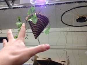
Why the long face? What’s that you say? The hanging plants are thirsty and they’re so high in the air? And the water? It’s so far away? And without a proper watering can, you have to make multiple trips to fill that old wine bottle enough times to satiate them?

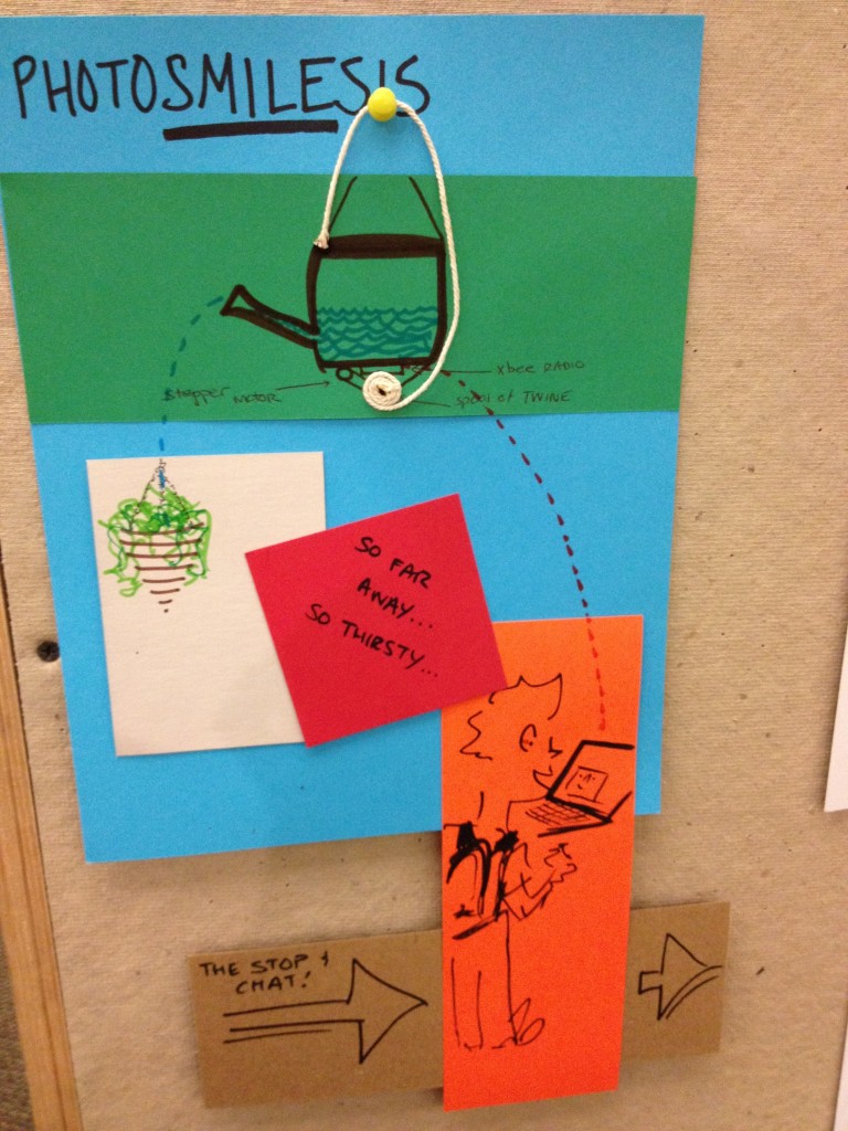
Introducing, the Photogrynthesis, a watering station that not only brings joy to your plants but downright requires it from you. Here’s how it works.

Step up to the watering station. Open the sliding door and give it your best grin.
Computer Vision detects your face and translates your smile into a digital signal that the Arduino can read.

The Arduino transmits that signal via radio communication to the radio receivers attached to each of three watering cans suspended on pulleys way up in the air (one for each plant)

For each second you smile, a stepper motor rotates one degree. This stepper motor controls the rotation of a spool of string. As the motor rotates, the spool releases string and increases its slack on one end of the watering can.

The weight of the water tips the watering can as the string releases its hold, simulating the motion of a water-wielding gardener’s elbow.

Close the door to the Photogrynthesis station, and wait a few moments for the plants to start reflecting your joy.

Ashton Grosz

Let’s Get Lost: Redesigning the GPS Process

September 17th, 2012 by The Artist Formerly Known as Kate

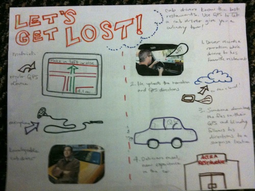
GPS devices for personal use usually help us figure out how to get somewhere we want to go. With a few simple additions, GPSs can get us lost and take us to someone else’s favorite place. This concept would be an optional modification to a GPS device, using existing technology. Instead of inputting a desired destination, users would rely on custom navigation and recorded narration from local cab drivers (in this example), directing them to a place they’ve likely never been.

Inspired by TaxiGourmet (http://www.taxigourmet.com), I envision using GPS devices as a communication system for taxicab drivers (and other “locals”) to lead other drivers to their favorite restaurants and out-of-the-way places.

  1. Using an external microphone with the GPS in his own car, Joe the taxicab driver records a narrative as he drives to his favorite restaurant. The mic records his voice, while the GPS records the car’s movements.
  2. Once he arrives at the destination, he uploads the narration and directions.
  3. Two weeks later, the Smith family is jonesing for some kimchi. They hop in the car and start typing in the address for their favorite Korean restaurant, when little Johnny Smith suggests using the “Let’s Get Lost” hack on their GPS. They leave their fate up to a random set of directions from a stranger. The Smiths are adventurous folks.
  4. The GPS device directs them to the starting point of the cab driver’s directions. Once they hit the starting point, Joe’s narration kicks in, leading them to a mysterious location that will not be revealed until they reach it.
  5. Twenty minutes later, the Smiths reach Joe’s favorite West African restaurant. There’s no kimchi on the menu, but they’ll find something new to try.

Let’s Get Lost is more about redesigning a process than physically redesigning the GPS hardware. This system would probably require an external microphone (already available on Garmin devices), possibly a SIM card (to streamline the process and avoid having to plug the GPS into a computer to upload), and some kind of web interface/app. It’s simply reappropriating a device that’s designed to get you to the “right” place in the more direct way. Users would be forced out of their local comfort zones and left at the mercy of a stranger, just as if they asked a cab driver to take them to his favorite restaurant.

third challenge

September 14th, 2012 by Michael Nitsche

Looking at Gaver and our very own Rock all the Things project: they propagate play as expressive form with digital media. The new challenge copies this approach and consists of two steps: 1) find a skill/ play property that most of us share 2) exploit this in a way that this activity becomes productive. Do so using digital stuff.

Flux Processing Unit (FPU)

September 13th, 2012 by Adam

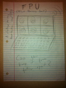
There is one big problem with notebooks: they are boring! Computers always used to be challenging devices that ask for creative problem solving and a high sensibility for their dysfunctionality. Today notebooks tend to become more and more this black boxes, emphasizing consume and standardization. It gets hard and hard to imagine them in any different way. Thankfully here comes the Flux Processing Unit (FPU)! The FPU is a hyper-intelligent, charismatic and fun personal computer that has a lifespan inscribed in his very design. The longer the interactor is working or playing with the FPU, the more its falling apart, both on the hardware and software side. It is the perfect challenge for every true hardcore nerd. We are bored of clean and highly subjective computers, we need to get back to the possibility of thinking about their design from different perspectives. The FPU is the perfect tool to emphasize the optimization throughout all layers of society.

The FPU is metadesign for everyone. It is intented to be a giving away for cheap for prototyping purposes and thus allows computer manufactures to monitor the needs and utilizes the creativity of their customers at the same time. It is sold as a living creature, both the hardware and software are falling apart with time. The challenge for the interactor is thus to develop procedurally strategies for overcoming the FPUs collapse.

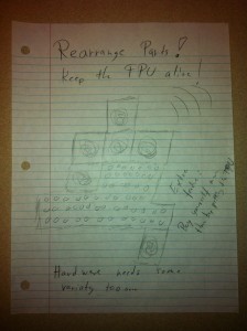
The FPU comes with 6 separate touch-stereoskopic-high-res-screens and tons of undefined buttons and other input devises. Each of the screens and input devises are detach- and reattachable. During the lifespan of the FPU the interactor will be forced with making a decision: Loosing usability and comfort or rearranging the parts and thus giving it more time. It is likely that most interactors will end up rearranging the parts in ways that make sense for them on the long run, but the FPU is also forcing them to take some risks, especially when they run out of convenient solutions. Additionally it is constantly communicating with all the other FPUs on the planet. There is also a extra feature available, which allows to expant the lifetime of the devise by petting it. This way the interactor has the opportunity to develop a very personally relationship to its FPU.

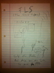
Every FPU comes with Flux Linux Sickness (FLS), the only operating system compatible with the FPU. This Linux participation is following the lifespan idea on the software side. Here the operation system, with all attached programs, also begins to fall apart and it is up to the interactor to develop procedurally solutions in order to maintain the lifespan of its FPU. One of the first elements that is going to die is the mouse. Thus the first task of the interactor will be to prohibit the mouse from dying. In order to do so he is playfully forced to redesign it.

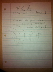
Additionally every FPU is equipped with the Flux Communication Annoyance (FCA). The FCA makes sure that all FPUs on the planet are constantly communicating and thus allowing for cloud-based computation. If the interactor is maintaining a healthy, and thus very well designed FPU, he might also acquire the right to develop and communicate his own procedurally developed design challenges to other FPUs. The FCA is not only a fun way of annoying each other, it also makes sure that not every single interactor is developing his own solutions for himself, but that the community is procedurally co-developing the future of computation. Thus every single FPU becomes not only a symbol of merging design and user time, but also mirroring the design ideas and challenges of all FPU interactors all over the planet, across time and space, nationalities and social class. 

Arduino Pinball Kit

September 12th, 2012 by FL-11630

For this week, we were challenged to re-imagine a way for user and design time to get closer together on a digital device, by enabling users to redesign the object. Plenty of opportunities for user redesign come to mind for software, in which accessible tools can be designed for arbitrary levels of content creation and experience customization, but in line with the challenge’s specification of “device” I aimed to come up with a hardware example.

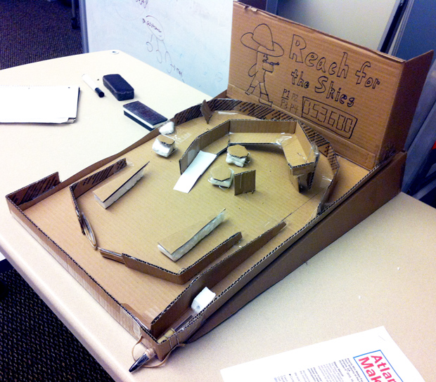
The overall concept I pitched was that of a modular pinball table, wired with an Arduino microcontroller to enable customization of playfield scoring and gating rules.

I built a crude, playable concept model to illustrate the intended scale and form:

Playable, though all-analog, concept model

The low half of the table is fixed firmly to the table, so the inlane/outlane divider, slingshots (triangles above the flippers), flippers, and plunger are positioned in their standard arrangement. The top half of the playfield however is perforated with holes, each providing a potential connection point for a bumper, spinner, stand-up target, ramp, or other playfield element. In the fully wired version, rather than using small holes with wires poking through, a more secure and flush electrical connection might be established by instead using screw sockets, filled with plugs for those not in use. Such a design would also enable arbitrary positioning of lights in/under the playfield, to also be orchestrated via the Arduino controller.

Guide: Text Page

Guide: Images Page

Crafting materio-digital combinations through use

September 12th, 2012 by some bears

This approach to technology as material positions humans as crafters who design technological objects through use. These objects are manufactured as  “workmanships of certainty” in an industrialized process that encapsulates and obscures operating logic behind set input methods.

In order to empower users without the knowledge or means to change the inner workings of the device, we might instead reimagine these technical objects as unfinished, subject to misuse by their owners.

Humans outpace machines in their abilities to personalize, improvise, anthropomorphize objects, and interpret new meaning from unexpected behavior. If we imagine gadgets as sites where users exercise such activities, we can imagine human crafters might redesign existing technologies with personal needs in mind. Humans have some knowledge of physical construction. Using this knowledge, they can redesign the object to output signs and signals that were not there before. These signals encourage further dialog with others or with the single user alone at “runtime.”

Three possible alterations leading to redesigned gadgets with new outputs and opportunities for reflection are presented here. The first two do not require the user to interact with the digital logic of the machine. The last example is possible only if the devices’ functionality is modular and interlocking to allow new combinations of sensor input and digital output.

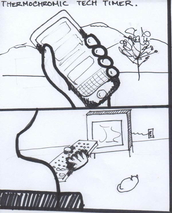
  1. Coat the device in thermochromic paint. When the device, such as a remote control or a cellular phone, has been held for a long period of time, the gadget will change colors. This visibly changed state of the device sends a signal to the user that a significant amount of time has been passed with the device in use. The user can determine for him or herself how to act based on his or her needs and the context of use.
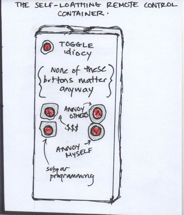
  2. Encase the object in a material that translates the gadget’s buttons into personally meaningful labels. For example, a remote control might be redesigned as a tool with limited use by obscuring buttons leading to undesirable outcomes, or by explicitly labeling buttons to reify the implications of their use. When increasing the volume of a button labeled “annoy neighbors,” the user is reminded (in that moment) that he or she may be creating an undesirable situation for others.
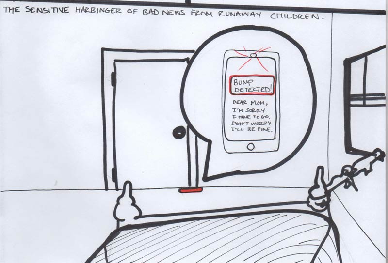
  3. A device reveals a pre-recorded message when it is moved. In this scenario, a child escapes from his bedroom window at night, leaving his smartphone positioned so that an opened door hits it. With access to the device’s logic, the child can program a simple interaction that displays a message when the device senses a change in compass direction. The child uses the device in absentia to say goodbye to his mother at the precise moment she discovers he’s gone.

Evolving Design

September 12th, 2012 by NOTAndrew Quitmeyer

Setup
The stated goal for this week’s design challenge is to think of a way to push design-time and use-time closer together in a digital device. This is based off Maceli’s Human Actor’s paper discussing meta-design. In my preliminary ponderings about this concept some thoughts rose up. First, that in other fields (like systems engineering) the processes of design and use can be thought of as a control system. Control systems are functions that take a stated goal (rotate the car 15 degrees left), produce an output in the real world (car’s new position is 13.8 degrees left), and (sometimes) receive feedback to bring the desired and the actual closer together (car only moved 13.8, move an additional 1.2 degrees). Generally the faster a control system can receive and process feedback, the more perfectly the system functions.

Traditional design could be viewed as a very poor control system with little feedback. A designer creates with a goal in mind (a perfectly comfortable chair), and the user deals with what comes out (this chair feels alright). More robust design-use systems feature closer feedback with user-testing and use-analysis for more iterative design process. As we shrink the feedback time and make our designerly control system more responsive, we get closer to this design challenge of pushing design and use time closer together. Let’s imagine a chair made of an even more perfect version of Hiroshi Ishii’s posit, “Perfect Red” (a digitally manipulable matter which allowed one to perform CAD functions on the object itself), which perfectly understood a users thoughts, words and actions. A user could receive a blank, “Perfect Chair,” sit in it, and command it physically, verbally, and emotionally until the user was perfectly content. This, I believe would present a concept of design and use being as close together as possible. The tightest possible feedback leading to beautifully responsive design.

A problem with this perfect control system, is that although the chair can give us whatever we want, we don’t always know what that is. Omnipotence kills innovation. One might not ever realize the benefits of a cup-holder in one’s “perfect chair.” The thought of splitting off a “perfect Ottoman” might be one of those things that doesn’t happen until you see it at a neighbor’s house. “What a great idea” one might say when seeing a fresh new type of “perfect chair” in an airport lobby. Some of these people with fresh new chair ideas might start receiving commisions to come up with their designs. Soon we are back to splitting apart design and use-time once more!

This is why mutations and arbitrary changes are so important in nature. This is why we have sex. Something can be optimized in its own niche, but without new or outside information, it cannot adapt. My answer to the design challenge attempts to push together design and use time closer, but only to a point where the design can still be meditated on, played with, and innovated.

Evolving Design

I propose objects that are responsive to their users, and the innovations of similar objects, though only in an indirect manner. The object’s shape and functionality will change according to evolutionary principles.

Rules

  • Everyone’s device starts out the same.
  • Everyone’s device possesses a code describing its current state and configuration (“genes”). This code can feature markup describing higher level functionality and descriptions (“alleles”).
  • Every night the device “dies,” automatically reconfigures itself, and is reborn as its own child. This is like asexual reproduction but the number of resulting objects remains the same.
  • The child’s genes are taken in some part from the parent device and a smaller amount are taken randomly (“mutation”).
  • The genes passed on are determined by a fitness function which results from how the user interacts with the device.
  • Two devices can reproduce sexually by leaving them  in close proximity overnight. This results in each splitting the code normally passed on to their singular children, but for each other’s child


An alternate idea I had was for Lamarkian Evolving Furniture. In this case the main difference would be that physical changes that happen to the device-creature, are passed on through its genes to the next subject. That is, you could beat your chair into a new shape, and its “child” would show signs of your previous physical manipulations.